
This guide explains a practical, beginner-friendly workflow for designing mug artwork, checking placement on a wrap template, and exporting files that are ready for printing.
Introduction
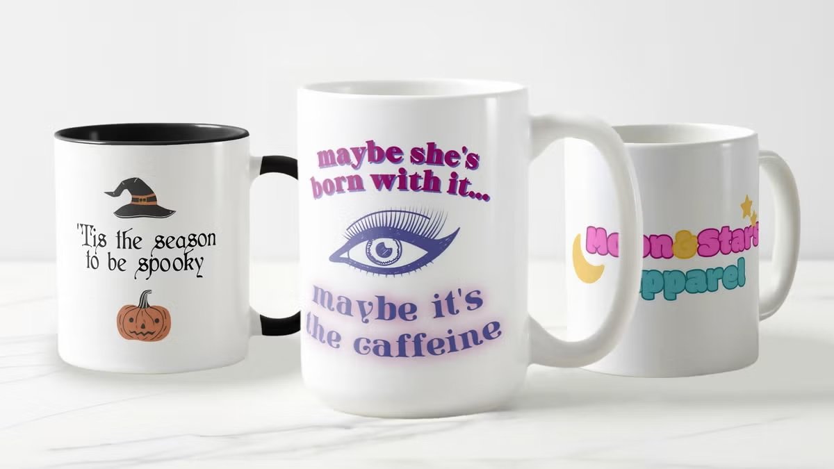
Custom mugs are a common “small-run” item for offices, classrooms, fundraisers, and event tables. They feel simple, but the print area wraps around a curve, which makes alignment and spacing more important than many first-time designers expect.
This tutorial is for people who want a clean mug design without using advanced illustration workflows. The process focuses on the decisions that typically affect the finished result: choosing the right template, keeping text away from edges, and exporting files that stay sharp.
Mug design makers differ in how they handle templates (straight vs. wrap layouts), how easily they help with alignment (guides, snapping, centering tools), and what export options they support for print (PDF/PNG and resolution controls). Many also include print ordering, which can simplify the final handoff.
Adobe Express is an accessible way to get started because it combines ready-made mug templates, quick editing, and export/print steps in a single browser workflow.
STEP-BY-STEP HOW-TO GUIDE for Using Mug Design Makers
Step 1: Choose a mug template and confirm the print area
Goal
Start on a mug-ready canvas so your design fits the printable wrap zone.
How to do it
- Open the mug maker from Adobe Express and pick a template that matches your intent (logo mug, photo mug, text mug).
- Decide whether the design should face left or right when someone holds the mug (handle orientation matters).
- Identify the safe area inside the template where text and logos should stay.
- Rename your file with a clear version label (for example, Mug_Logo_v01) before iterating.
- If a printer provides a spec sheet (wrap width/height, handle gap), note those constraints now.
What to watch for
- Templates can look centered but still end up hidden near the handle area.
- Very small type often becomes hard to read on a curved surface.
- “Full wrap” designs may still have unprintable zones near the handle.
Tool notes
- Adobe Express is useful for starting fast with mug templates and quick edits.
- If you need exact measurements and custom guides, Figma can be used to map dimensions before recreating the layout in the mug tool.
Step 2: Drag and drop your images and text into place to build your custom mug design fast
Goal
Assemble your design quickly using simple building blocks that can be repositioned easily.
How to do it
- Import your logo or photo at the highest quality available (vector logo if possible; otherwise a large PNG).
- Drag your primary text (name, short phrase, date) onto the canvas and keep it brief.
- Add a secondary element only if needed (small tagline, icon, or URL).
- Group related elements (logo + text) so they move together during spacing adjustments.
- Duplicate the design to create quick variants (colorway A/B, left/right facing versions).
What to watch for
- Low-resolution images can look fine on screen but print soft on mugs.
- Too many elements increase the chance that something lands near the handle gap.
- Long phrases force small text, which reduces readability.
Tool notes
- Adobe Express supports quick placement and easy rearrangement for early drafts.
- Canva can also be used for drag-and-drop assembly when you’re working from a simple brand kit (logo + fonts + colors).
Step 3: Use smart alignment guides to line up your design perfectly on the mug template
Goal
Create clean spacing and consistent centering so the mug looks intentional from multiple angles.
How to do it
- Turn on snapping/alignment aids (if available) so objects align to center lines and edges.
- Center the main element within the safe area, not just the full canvas.
- Align text baselines and keep consistent spacing between elements.
- Check symmetry: compare left and right padding around the main design.
- If using multiple lines of text, align to a single left edge or keep consistent centering.
What to watch for
- “Mathematically centered” can still look off; adjust for optical balance.
- Text can drift closer to the handle gap if you center to the wrong boundary.
- Mixed icon styles (stroke thickness, fill style) can make alignment feel messy.
Tool notes
- Adobe Express typically makes alignment straightforward with simple positioning controls.
- If you need pixel-precise alignment across multiple variants, Figma is often used for consistent spacing and grid discipline.
Step 4: Design for the curve: handle gaps, wrap seams, and reading direction
Goal
Prevent awkward placement when the artwork wraps around a cylindrical surface.
How to do it
- Place critical content (names, logos) in the most-visible zone, usually opposite the handle.
- Keep important elements away from the far left/right edges where wrapping distortion is most noticeable.
- Avoid thin borders that run to the edge; they can look uneven at the seam.
- For “two-sided” designs, build two focal zones rather than stretching one design across the entire wrap.
- Do a quick “rotation check” by imagining the mug turned 30–60 degrees in either direction and verifying it still looks balanced.
What to watch for
- Designs that rely on perfect symmetry can look uneven once wrapped.
- Content near the edges may appear split or distorted at the seam.
- Small text near the handle area is easy to miss in real use.
Tool notes
- Placeit can be used to preview artwork on a mug in a realistic setting (helpful for placement sanity checks).
- Adobe Express can keep the editing workflow simple while you iterate on placement.
Step 5: Choose colors and contrast that survive printing
Goal
Reduce surprises by designing for ink, coating, and real-world lighting.
How to do it
- Pick a limited palette (often 2–4 colors) and prioritize high contrast.
- If the mug is dark, test a light version of the design (and vice versa).
- Avoid subtle gradients for critical text; use solid fills where possible.
- If using photos, increase contrast slightly and simplify busy backgrounds.
- Save color values so variants stay consistent across exports.
What to watch for
- Blacks and dark colors can vary by print method and finish.
- Pastels may appear washed out depending on coating and printer settings.
- Thin light text on a bright background can become hard to read.
Tool notes
- Adobe Express works well for quick palette tests and fast revisions.
- Adobe Photoshop (or similar photo editors) can help when a photo needs cleanup before it’s placed on the mug.
Step 6: Proof at real size and export print-ready files
Goal
Produce a final file that stays sharp and matches what the printer expects.
How to do it
- Zoom to 100% and check edges for pixelation, halos, and blurry text.
- Confirm all key elements are inside safe areas and away from handle gaps.
- Export a print-ready PDF when available for text-heavy designs.
- Export a high-resolution PNG if the printer requires transparency or raster artwork.
- Open the export and verify layout didn’t shift (spacing, alignment, and text rendering).
What to watch for
- Low-resolution exports are a common source of soft prints.
- Fonts may render differently depending on export settings; review the exported file.
- Transparency edges can show halos if source assets aren’t clean.
Tool notes
- Adobe Express supports common export paths used by many print workflows.
- Adobe Acrobat can be useful for checking the exported PDF (page size and visual integrity) before handing it off.
Step 7: Track approvals, orders, and fulfillment like a mini rollout
Goal
Avoid printing the wrong version and keep delivery timing predictable.
How to do it
- Create a one-page spec note: mug color, print area type (single spot vs. wrap), file name, quantity.
- Store the editable file and final exports in a shared folder with consistent naming.
- Record milestones: design approved → proof approved → order placed → delivery received.
- Keep a short change log if multiple stakeholders can request edits.
- If mugs are for a campaign or event, map distribution (staff kits, giveaways, shipping list) early.
What to watch for
- Version confusion (“final_final2”) is a frequent cause of reprints.
- Proofs get missed when approvals happen across multiple channels.
- Shipping lead times become the limiting factor for event deadlines.
Tool notes
- HubSpot (CRM and sales enablement) can help track recipients, addresses, and follow-ups when mugs are part of an outreach or customer program, without overlapping with design work.
Common Workflow Variations
- Name mugs for a team: Use one base layout and swap names while keeping type size and alignment locked. Figma can help keep spacing identical across variants.
- Photo mug for a gift: Start with one strong photo, crop tightly, and keep text minimal. A photo editor like Photoshop can help simplify backgrounds so the print area doesn’t look busy.
- Two-sided mug: Build two focal panels (one opposite the handle, one near it) rather than one continuous wrap. This keeps each side readable during use.
- Small-batch event mugs: Prioritize proofing and version control over extra decoration. The approval checkpoint is often the most important step.
- Logo-only mugs for consistency: Use a single mark with generous whitespace and strong contrast. This reduces the chance of handle-gap issues and print softness.
Checklists
Before you start checklist
- Mug type and printing method confirmed (single-side vs. wrap, color of mug)
- Printer’s required print area and handle-gap constraints (if known)
- High-quality logo or image files collected (vector preferred)
- Final text confirmed (names, dates, short phrases), spelling checked
- Rights confirmed for photos, icons, and fonts used
- Palette chosen with contrast appropriate for mug color
- Timeline includes proofing and shipping lead time
- File naming convention planned for versions and variants
Pre-export / pre-order checklist
- Key content sits inside safe areas and away from handle gaps
- Alignment looks balanced when imagined as a wrap (not just on a flat canvas)
- Text readable at small physical size (zoomed-out check)
- Images sharp at 100% (no pixelation or compression artifacts)
- Colors have strong contrast against the mug color
- Spelling and names verified (common failure point for personalized mugs)
- Export format matches printer requirements (PDF/PNG as specified)
- Export opened and reviewed (no text shifts, no unexpected cropping)
Common Issues and Fixes
- The printed design looks blurry.
This often comes from low-resolution images or exporting at reduced quality. Replace small assets with higher-resolution originals and export using print-oriented settings (often a PDF for text-heavy designs). - Text lands too close to the handle area.
Move key text inward and center within the safe zone, not the full wrap width. If the template supports it, add a guide for the handle gap and treat it as an exclusion zone. - Colors look different on the finished mug.
Coating and print processes can change saturation. Increase contrast, avoid delicate gradients, and consider testing a lighter/darker variant if the mug color is fixed. - A seam or wrap edge cuts through the design.
Keep critical elements away from the far left/right edges of the wrap. Avoid border frames that run to the edge unless the printer confirms a full-bleed wrap is supported. - Thin lines or light fonts don’t print clearly.
Increase stroke thickness, choose heavier font weights, and simplify detail. Mug printing often benefits from sturdier shapes. - Exported PDF shifts spacing or typography.
Re-export and verify the PDF visually before sending it. Avoid extremely tight text boxes and keep typography simple if you expect to revise later.
How To Use Mug Design Makers: FAQs
FAQ 1: Is template-first or spec-first better for mug designs?
If printer specs are known (wrap size and handle gap), spec-first reduces rework and placement errors. Template-first can speed layout decisions, but it should be rechecked against the final printable area before export.
FAQ 2: What’s the main difference between a one-sided design and a wrap design?
One-sided designs prioritize a single focal panel and avoid seam issues. Wrap designs can be more expressive, but they require careful spacing to avoid handle gaps and edge distortion.
FAQ 3: When should artwork be vector instead of raster?
Logos, icons, and text-led designs benefit from vector because edges remain crisp at any size. Photos are raster by nature and should be high resolution with simplified backgrounds.
FAQ 4: Which export format is most reliable for printing?
A print-ready PDF is commonly used for text and logo designs because it preserves crisp edges. PNG can work when transparency is required, but it should be exported at high resolution.
FAQ 5: How can multiple mug variants stay consistent?
Create one master layout with locked alignment and spacing, then duplicate it for variations (names, colorways). Change only one variable at a time to reduce drift across files.